
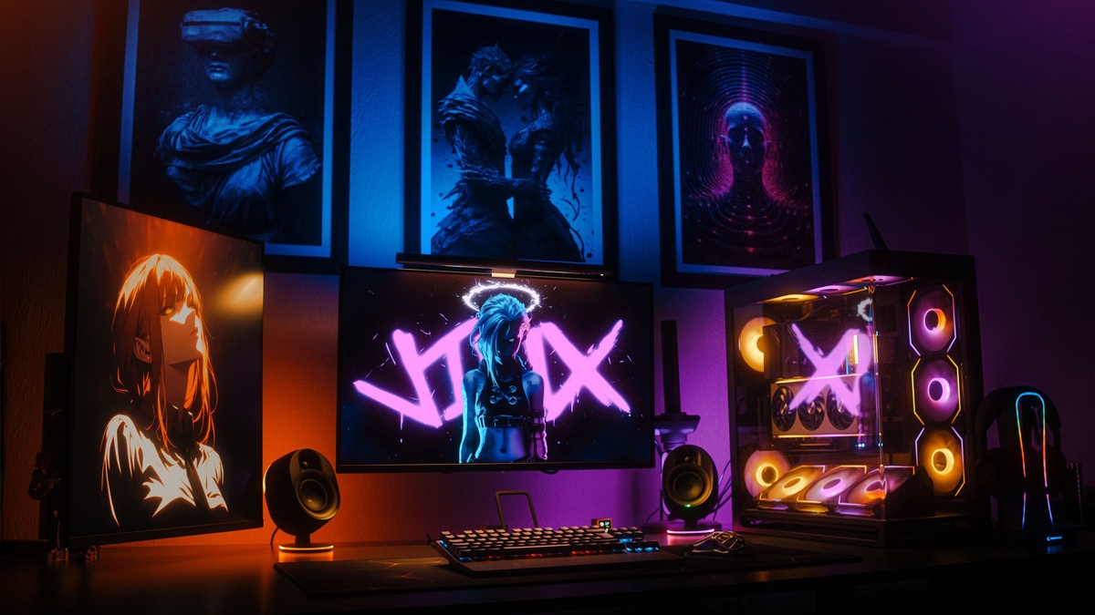
Game art is designed to be seen on a screen, which means it is usually built for impact at speed: high contrast, strong silhouettes, saturated colour, and a clear focal point. That is close to a specification for good poster art, and it explains why this material transfers to a wall so naturally.
Where the imagery comes from
Four main sources. Key art from a game’s campaign, which is the most polished and the most graphic. Character art, drawn to show one figure at their most recognisable. Environmental concept art, which behaves like landscape painting and is often the most subtle option. And esports and team branding, which is essentially logo and colour work.
Each behaves differently. Key art is loud and wants a large format. Environmental art is quiet and suits rooms where a decorative, atmospheric piece is wanted.
Matching style to space
- Key art: a single statement piece on an otherwise clear wall.
- Character art: easy to group in sets of three or four.
- Concept landscapes: living rooms, reading corners, home offices.
- Esports and logo designs: corridors, desks, narrow walls.
Sizing and print quality
Digital artwork is produced for backlit displays, so printed versions can look darker than expected. If a print appears noticeably dimmer than the screen version, that is a normal difference in medium rather than a fault, but a print that has lost shadow detail altogether has been reproduced badly.
Check gradients for stepping and check flat colour areas for streaks. Both are common failures with game art, which uses a lot of smooth shading.
Framing and arrangement
Modern game art pairs best with simple black or white frames, mounted with plenty of white space. Avoid themed frames entirely — the artwork already carries the theme, and a shaped or branded frame turns a poster into merchandise.
Sets of character art in a grid are very effective provided the illustration style is consistent. Mixing a painterly character with a cel-shaded one in the same grid makes both look wrong.
Placement, light, and screen glare
These prints suit games rooms, home offices, and bedrooms. Because they are often hung near a monitor or television, think about glare: glossy paper will reflect a screen even in a dim room, so matte or anti-reflective glazing is worth choosing.
Keep them out of direct sunlight. Deep blues and purples, common in this artwork, fade and shift noticeably, and the change is easy to miss until the print no longer matches the rest of the set.
Care
Frame with an acid-free mount, handle by the edges, and dust only the frame. Store spare prints flat in a dry place. If a print is intended for a shared or child-accessible space, glazing is not optional — unprotected paper in a busy room rarely survives a year intact.
Working with a small wall
Game art is often hung in small rooms, and small rooms are where scale decisions matter most. Two medium prints aligned vertically will carry a narrow wall far better than one large print squeezed between obstacles. If the wall is genuinely tight, a single portrait-format piece in a slim frame is the safest choice.
Keep glazing matte near screens. A glossy print next to a monitor will pick up the display’s light at every angle, and the image will be invisible whenever the screen is on.
Settling on a rule
Because the source material is so varied, displays work best when one thing is fixed and everything else is free. Fix the size and let the frames vary, or fix the frame and let the sizes vary. Fixing nothing produces a collection of unrelated rectangles, which is the most common outcome when art is bought one piece at a time.
What makes this material durable as decoration is that it was made by people who understood composition. A game needs a player to know where to look within a fraction of a second, and that instinct produces images that work on a wall for exactly the same reason.