
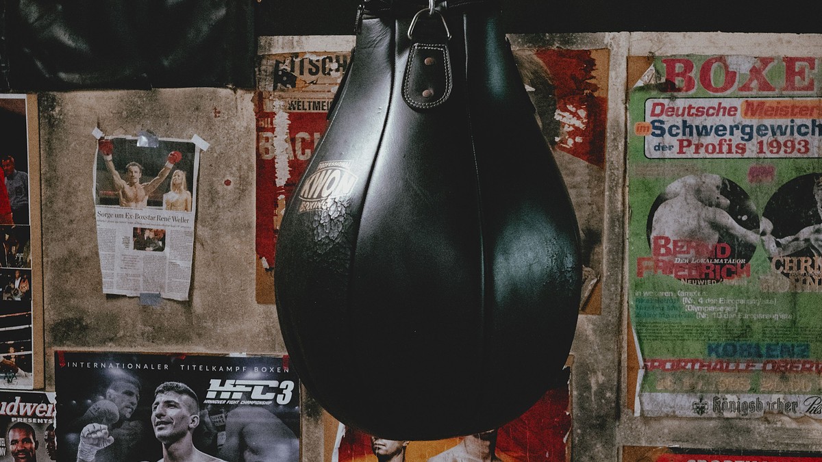
Boxing gives photographers something very few sports do: stillness at the centre of violence. Two figures, close together, waiting. The images that survive from the sport’s history are rarely the punches; they are the moments before and after, when the drama is entirely in the posture and the face.
The drama of the static frame
A staredown photographed well is more powerful than any action shot, because the composition is symmetrical and the tension is legible. Ring shots taken from below, with the lights above and the crowd in shadow, produce that same graphic quality: a lit subject, a dark surround, and a clear shape.
This is also why boxing art works in black and white so well. The sport’s visual history is largely monochrome, and the grain and contrast of those photographs give them a documentary seriousness that colour rarely matches.
Treatments worth considering
- Vintage black-and-white portraits: classic, serious, excellent over desks.
- Ring-action photography: dynamic, best in wide formats.
- Posterised and illustrated designs: bold graphic options for a set.
- Typographic fight-bill designs: quiet, decorative, strong in pairs.
Format and framing
Portrait formats dominate and suit narrow wall space and vertical pairs. Wide ring shots need wide walls. Fight-bill style designs, which mimic printed handbills, work well as small pieces in a row of three or four.
Frames should match the mood: black and slim for documentary photography, warmer wood for vintage portraits. Mount on acid-free board and keep the paper clear of the glass.
Where it belongs
Gyms, home training spaces, studies, and bars are natural settings. A single portrait above a desk or a bench reads as a statement of intent, and a pair of vintage portraits hung side by side creates the sense of an event before the fact.
Because the imagery is forceful, it benefits from space. Leaving a stretch of empty wall around a single large piece will almost always look better than filling the wall with several.
Light and condition
Keep prints out of direct sunlight and away from humid rooms. Handle by the edges and avoid touching the printed surface; matte photographic papers mark easily, and the marks are permanent.
Dust with a dry cloth at the frame, and store spares flat between clean boards rather than rolled, which leaves a curve that never fully relaxes.
The lasting appeal
Pairs, sets, and spacing
Boxing imagery pairs unusually well because the sport is built on opposition. Two portrait prints hung side by side read as two fighters before a bout, which is exactly the narrative the photographs already tell. A third piece added to that pair almost always weakens it.
Spacing is the detail that makes the pairing work. Keep the gap between the two prints tighter than the space around the pair as a whole, so they read as one unit rather than two separate pictures near each other. Twenty to thirty per cent of the print width is a comfortable gap.
Care in training spaces
Prints hung in gyms and workshops face heat, humidity, and movement. Glazing is essential there, and the frame should be deep enough to keep the paper off the glass even if the wall shifts slightly. Matte photographic papers mark easily, so handle these pieces by the edges only, and keep them in their sleeves until the moment they are framed.
Condition and the look of age
Age suits this material. Slight grain, a warm paper tone, and a soft edge are part of the documentary quality of older sports photography, so prints that look a little lived-in often hang better than a perfectly clean reproduction. What does not suit it is physical damage: creases, foxing, and water marks read as neglect rather than character, and no frame hides them.
Boxing’s visual archive is small compared with most sports, and that scarcity is part of its power. There are not hundreds of images of a great fighter — there are a few, and each one carries the whole career. That is precisely what a wall needs.