
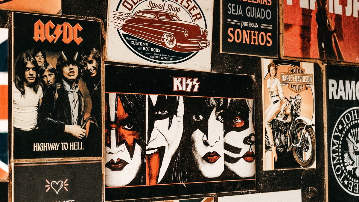
The concert poster of the nineteen seventies is a product of a specific set of limitations: cheap offset printing, a small budget, a promoter who needed something on a wall by Friday, and a designer willing to experiment. Those limitations produced some of the most inventive graphic work in music history.
What the era got right
Two things. First, colour: limited ink runs forced flat, saturated palettes, and the results are graphically stronger than most modern gradients. Second, type: letterforms were drawn by hand, distorted, stacked, and stretched, yet still readable — a balance that is far harder to achieve than it looks.
The third characteristic is generosity of scale. These posters were often printed large because they were meant for shop windows and venue walls, and they were designed to be read from across a street.
The main visual families
- Psychedelic lettering: organic type, warm oranges and purples, dense ornament.
- Bold geometric bills: heavy capitals, blocks of flat colour, straight lists of bands.
- Illustrated bills: drawn figures, instruments, and stage imagery around the type.
- Photographic bills: a single band photo with the line-up set beneath it.
Notes on reproduction and print quality
These designs were built for cheap printing, which means they survive it. Wide areas of flat colour tolerate amateur reproduction better than photographs do. Where a poster reproduces fine ornamental line work, though, check that the lines stay separate instead of filling in — that is the first thing to fail.
Also expect heavy texture. The paper of the period was coarse, and print that looks slightly grainy is closer to the original than something perfectly smooth.
Framing and display
This artwork suits wide horizontal formats and looks at its best above long, low furniture: a sideboard, a bench, a row of bookcases. Vertical bills suit corridors and narrow walls, where their height matches the architecture.
Keep frames plain and avoid heavy mounts on dense psychedelic designs, which already carry plenty of visual weight. A simple black or natural wood profile is the safest choice.
Placement and light
Warm palettes look best in rooms with warm light — lamps rather than ceiling floods, wood rather than chrome. In a modern white room, one large bill can work well as the single source of colour.
Fading is the real risk with saturated vintage-style inks, so keep prints off walls that take direct sun, and avoid humid rooms entirely.
Care and storage
Handle by the edges, frame with an acid-free mount so the paper never touches the glazing, and store anything not hanging flat, in a dry place, protected from light. If you collect several, rotate them rather than hanging everything at once — the prints will last longer and the wall will look better.
Where collectors go wrong
The most common error is over-filling a room with dense psychedelic designs. Individually each is spectacular; together they become a wall of noise, and the eye has nowhere to settle. One large busy bill on a calm wall will outperform four of them side by side every time.
The second error is hanging this artwork in a bright modern room, where flat 1970s colour can look unexpectedly harsh. Introducing wood, warm lamps, and a mid-tone wall makes an enormous difference to how the palette reads.
Rotating a collection
Period posters are often collected faster than they can be hung, and rotation solves the problem neatly. Keeping three or four out at a time and storing the rest flat, out of light and damp, means the wall stays fresh and the paper survives. Rolled storage should be avoided entirely with this material; the paper of the era creases readily and the curl never fully relaxes.
What makes this era’s posters collectable is that they were never intended to last. They were working advertising for a single night, made with real design ambition, and that combination is exactly what gives them their energy on a wall today.