
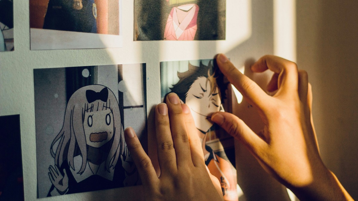
Japanese animation and comics have produced one of the largest bodies of illustration in the world, and the range is wider than most people expect. There is clean digital cel work, hand-inked line art from older series, painterly background illustration, and dense panel pages taken straight from the printed page.
Four distinct looks
The first is the character key visual: a single figure in a strong pose against a graphic background. These are the most common and the most immediately recognisable. They work well at large sizes and are easy to arrange in groups.
The second is the scenic frame — a landscape or cityscape with tiny figures, often with dramatic light. Quieter and more atmospheric, these suit rooms where a subtle piece is wanted.
The third is the panel page: an actual page of sequential art, reproduced in full. These have huge appeal for readers but demand close viewing, because the storytelling only works at reading distance.
The fourth is typographic and symbolic art built around a single motif — a symbol, a mask, a piece of insignia from a story.
Matching the image to the room
- Character key visuals: bedrooms, studies, games rooms.
- Scenic frames: living rooms, reading corners, hallways.
- Panel pages: corridors, close-viewing spots, above desks.
- Symbolic designs: excellent in sets and for narrow walls.
Sizing and framing notes
Character art is drawn with clean outlines and flat colour, so it survives enlargement well. Panel pages lose legibility quickly when scaled up; keep them modest. Scenic artwork with soft skies benefits from a larger format, since the effect depends on atmosphere rather than detail.
Choose a plain frame. This artwork is usually saturated and busy, and it does not need help. A neutral wide mount separates the image from a pale wall and stops a light-coloured piece from floating.
Composition when grouping
Series artwork invites grouping, and grouping works best with a single rule. Two common choices: all prints the same size in a strict grid, or one large anchor piece with two or three smaller companions. Avoid mixing both approaches on one wall.
If you are combining characters from different series, keep the illustration style consistent. A painterly piece next to a hard-edged cel image usually looks accidental rather than curated.
Light and condition
Anime and manga artwork leans on saturated blues, reds, and yellows, all of which fade under ultraviolet light. Keep prints off walls that take direct sun, and consider glazing with UV filtering if the room is bright. Humid spaces should be avoided altogether — paper cockles before the ink fades.
Dust the frame, not the print. Handle by the edges, and store unframed pieces flat between clean boards.
Why it works on a wall
Making a themed corner work
A themed display is easier to get right than a scattered one, because the theme provides the rule. Pick a corner or a single wall, choose a consistent frame and size, and let the imagery vary within those limits. The result reads as a deliberate arrangement rather than an accumulation of purchases.
One large anchor print plus a row of smaller pieces is the most reliable structure. Anchor first, then fill around it. Doing it the other way produces a wall that cannot answer the question of what it is about.
Avoiding over-filling
The instinct with a subject this broad is to keep buying. Resist it. Every additional piece reduces the impact of the others, and a corner of four well-chosen prints will look better in two years than a wall of fifteen that was assembled quickly.
Good illustration communicates a whole world in one frame. That economy is why this artwork holds up outside its original context: it does not need a plot or a caption to be understood, only a viewer willing to look at it.