
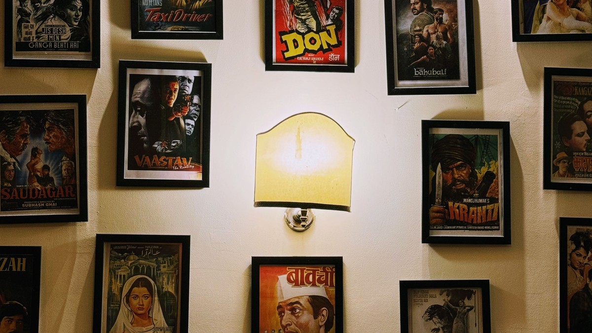
Cinema’s golden age produced poster design that was closer to illustration than advertising. Hand-painted faces, dramatic perspective, restrained typography, and a palette limited by the printing technology of the day. Those constraints produced images with enormous graphic strength, and they remain some of the most collected wall art in the world.
What makes the classic period distinctive
Posters from the middle of the last century were painted rather than photographed. An artist worked from stills and memory, simplifying faces into shapes that would read from across a street. The result is stylised portraiture with a strong sense of colour and no distracting detail.
Typography from the period is another draw. Painted lettering, hand-drawn titles, and generous margins give these designs a calm confidence that modern film marketing rarely achieves.
Genres and their visual codes
- Drama and romance: soft palettes, large single faces, minimal type.
- Thriller and noir: high contrast, deep shadow, low camera angles.
- Adventure and western: wide landscapes, silhouettes, saturated skies.
- Science fiction: bold geometry, strong primary colours, dramatic scale.
Choosing format and size
Classic film posters are almost always vertical, and that proportion is part of the look. Cropping one to a square removes the composition’s rhythm. Where a design is horizontal — lobby-card style — keep it horizontal and hang it lower, since wide artwork reads better below eye level.
Large sizes suit statement walls and stairwells. Medium sizes suit pairings: two posters on the same theme hung side by side, or one large piece with two smaller ones beneath. Keep outer frame dimensions consistent within a group.
Framing an illustrated print
Illustrated artwork tolerates a wider mount than photography and often benefits from it, since the margins in the original design are part of the composition. A simple frame in black, natural wood, or dark metal keeps the emphasis on the artwork. Non-reflective glazing is worth the extra effort for these dense, detailed images.
Placement and light
These prints suit rooms with a bit of age to them: a study, a hallway with a picture rail, a stairwell. They also work extremely well in a modern room as a single anchor piece, where the vintage palette provides the only warm colour in the space.
Fading is the main long-term risk with older-style printed colours, so keep them out of direct sun and away from humid rooms.
Care over time
Handle by the edges, frame with an acid-free mount, and store spares flat in a sleeve rather than rolled. If you rotate artwork seasonally, avoid re-framing too often — every time a print is handled there is a small chance of a crease.
Reprints, and what to expect from them
Most classic film artwork available today is reproduced from archival scans, and the results vary widely. Good reproductions keep the texture of the original brushwork and the slight softness of old printing. Poor ones are over-sharpened, with contours and flat colour that make an illustrated poster look like a vector graphic.
A useful test is the lettering. Hand-drawn titles have small irregularities in stroke width; if a reproduction has made those strokes perfectly uniform, the character of the original has been lost even though the design is intact.
Hanging a period piece in a modern room
Old artwork in a contemporary space works best as the only warm element. Keep the surrounding wall plain, the frame simple, and the furniture calm. If the rest of the room is already patterned or colourful, a vintage poster will read as clutter rather than contrast.
The reason this material endures is simple: these were made by people drawing a single strong idea. That clarity is what makes them work as wall art decades after the films themselves have stopped being watched.