
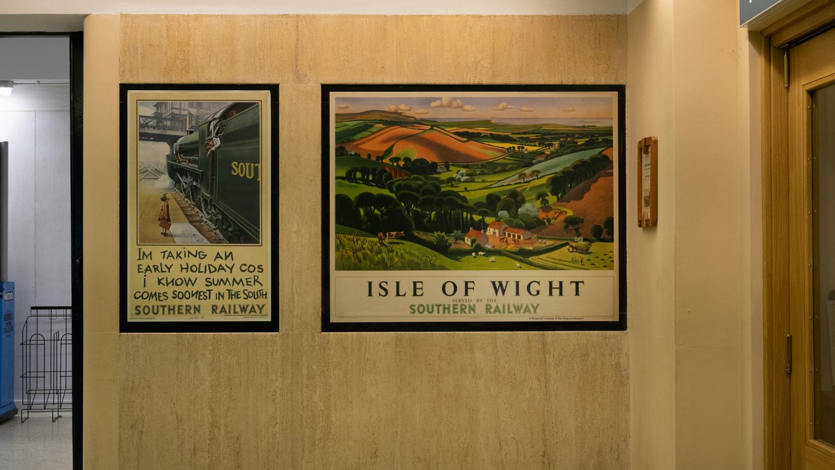
Travel posters from the first half of the last century were made to sell tickets, and the result was a form of art that had to be simple, persuasive, and readable from a moving train. Nearly a century later those constraints are exactly why the images still work on a wall: no clutter, no ambiguity, one destination and one idea.
The visual formula
Three elements recur. A simplified landscape or skyline, painted rather than photographed. A limited palette, often just three or four flat colours, dictated by lithographic printing. And lettering placed with real care, usually hand-drawn and balanced against the image rather than dropped on top of it.
Because the compositions were built for distance, they scale without effort. A small print and a large one carry the same weight; only the room around them changes.
Regions and themes worth knowing
- Rail and coastal resort designs: bright, optimistic, strong on verticals.
- Mountain and alpine scenes: cooler palettes, wide formats, snow light.
- Ocean liner and aviation art: dramatic gradients, bold geometry.
- City skyline designs: architectural, excellent above long furniture.
Grouping a wall of destinations
These posters are made to be grouped. A set of three or four destinations on one wall is one of the most reliable arrangements in interior design, because the shared formula holds them together and the differences make the group interesting.
Two rules matter. Keep frame and size identical across the group, and vary the images only. A row of four with equal gaps on a common centre line needs no other decoration.
Paper, framing, and fading
Vintage-style printing is flat and graphic, so it tolerates matte paper better than glossy. Matte also avoids the reflections that ruin a strongly coloured print under a downlight. A plain frame in wood or black keeps the emphasis on the design.
Fading is the main long-term risk. Reds and yellows are vulnerable, so keep prints away from direct sun and away from humid rooms such as kitchens and bathrooms.
Placement
Hallways, stairwells, bedrooms, and home offices all suit this material. The genre also works unusually well in modern interiors, where a single vintage piece provides the only warm colour in a neutral scheme.
Hang lower than you might expect. These images were designed to be read at eye level, and a print centred around 150 centimetres from the floor tends to feel more considered than one pushed up near the ceiling.
Care
Handle by the edges, frame with an acid-free mount, and store spares flat in a sleeve rather than rolled. If you rotate art seasonally, protect the spare prints from damp and sunlight in storage as carefully as you would on the wall.
The danger of over-matching
These designs share a formula, which makes them easy to group and easy to over-group. A row of six identical frames in identical sizes on one wall can start to read as a printed border rather than a collection. Three or four is usually the point at which the arrangement is at its best.
If you want to add more, separate them. One pair in a hallway and one in a bedroom reads as considered; all six together reads as wallpaper. The same principle applies to colour: keeping every poster from the same region flattens the group, while two or three different palettes give it life.
Reproductions and colour shift
Reproduced vintage artwork is often cleaned up during restoration, and cleaning can shift the palette slightly towards modern saturation. If you want the muted look of actual period printing, prefer reproductions that keep visible paper texture and slightly uneven colour fields over those that have been smoothed to a flat, digital finish.
What makes this material endure is that it was never trying to be fine art. It was trying to be clear, and clarity is the quality that gives a poster its life.