
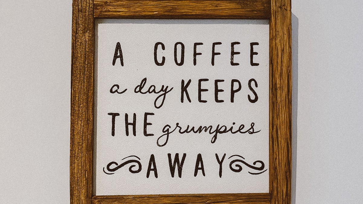
Words on a wall are a different craft from pictures on a wall. Type has to be legible at a distance, it has to hold together as a composition, and it has to say something worth reading more than once. Done well, a typographic print is the most versatile piece of wall art there is; done badly, it is wallpaper with an opinion.
What separates good type from filler
Three things. The typeface has to suit the message — a heavy grotesque for something blunt, a light serif for something reflective. The line breaks have to be handled deliberately, so the shape of the text block is part of the design. And the amount of text has to be small. Two or three lines read across a room; a paragraph does not.
Colour matters less than contrast. Black on off-white, white on deep navy, a single accent word in a warm red. Limited palettes age well.
Formats that work
- Single short phrase, very large: a statement piece for a hallway or landing.
- Stacked type block: good in portrait formats above a desk.
- Quote with attribution: suits a study or a reading corner.
- Grid of short words: excellent as a set of small matching prints.
Sets and series
Typographic prints group unusually well because they introduce so little colour. A set of three short phrases in matching frames is one of the easiest arrangements to hang well, and it suits awkward walls — a narrow strip beside a door, the space above a row of hooks.
Keep the typeface and colour identical across a set. The only thing that should change is the words.
Sizing and framing
Lettering needs size to be read. If the text is meant to be understood from a sofa, the caps should be tall enough to read comfortably from there — usually meaning a medium print or larger. Small typographic prints work best where people stand close, such as a hallway or above a kitchen counter.
Wide mounts suit type prints, giving the words room to sit in. A plain frame in black or natural wood is almost always right.
Placement and light
Offices, kitchens, reading corners, and corridors are the natural settings. Avoid hanging a text print with a strong directional light above it, since a single reflection can erase a whole word. Matte surfaces and diffused light keep the lettering readable from every angle.
Also avoid direct sun. Thin black lettering on pale paper shows fading and yellowing earlier than almost any other artwork.
Care
Frame with an acid-free mount, keep the surface dry, and dust with a soft cloth. Store spares flat. Because these prints are usually light and simple, they tend to be handled casually — which is exactly when corners get bent.
Choosing words you will not tire of
Text on a wall is read every day, far more often than an image is looked at. That makes the wording more important than the typography. Short and specific survives; long and motivational does not. Anything that sounds like a slogan or a caption will feel stale within a few months, while a single precise phrase can stay for years.
If the words carry meaning for the room rather than for a poster, they will keep working. A line about music belongs near the record player. A line about patience belongs in the workshop. Context is what stops typographic art becoming wallpaper.
Legibility from the sofa
Before committing, decide where the print will be read from and check that it works at that distance. Symmetric type on a plain background is the most readable; thin weights, wide letter spacing, and low contrast between text and paper all reduce legibility. If the design cannot be read from the intended spot, a larger print is a better answer than a bolder font.
Good typographic art earns its place because it is both decoration and thought. Chosen carefully, it can do the work of a whole gallery wall with a single line of text.