
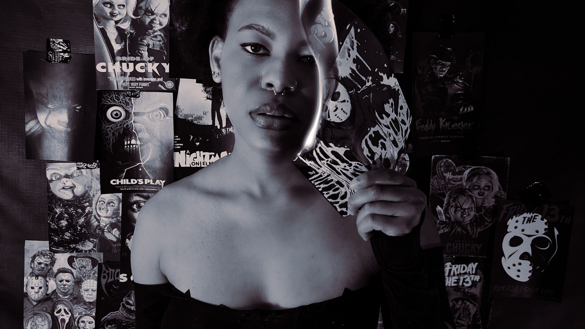
Horror has produced some of the most disciplined poster design in cinema, mostly for practical reasons. A horror poster has one job: unsettle the viewer before they know anything about the film. The result is a body of art built on negative space, high contrast, and a single disturbing idea.
Why the design is so restrained
Fear works better with less information. The classic horror compositions leave most of the frame dark or empty, place one element in a deliberate position, and let the viewer complete the picture. Illustrated versions of that approach are unusually effective as wall art because the emptiness that makes them scary also makes them calm to live with.
The typography follows the same logic: condensed capitals, wide letter spacing, and very little of it.
Styles worth knowing
- Silhouette and shadow: the most restrained and the easiest to hang.
- Illustrated creature art: bolder and more decorative, better large.
- Photographic stills: strongest in small, close-hung pairs.
- Type-led designs: the most subtle option, and often the most effective.
Size, format, and framing
Vertical formats dominate and should be preserved. Dark compositions benefit from a light mount and a plain black frame, which stop the print from dissolving into a dark wall. If your wall is already dark, a thin white mount is the simplest fix.
Scale is a matter of intent. A large dark print on an otherwise empty wall is genuinely atmospheric. Several small ones clustered together read as a collection and lose the effect.
Where to hang horror art
Hallways, stairwells, and studies suit this material naturally — places people move through, where a brief unsettling image works. Living rooms take it too, as long as the palette matches: the prints sit well with deep greens, charcoal, and dark wood, and poorly with bright pastels and busy wallpaper.
Avoid bedrooms if you want the room to stay restful. Dark imagery seen last thing at night has an effect that most people underestimate.
Handling and care
Because these prints are usually dark and glossy, surface marks show badly. Handle them by the edges only, frame behind glazing, and never wipe the printed surface. Dust collects visibly on dark artwork, so clean the frame and glass regularly with a dry microfibre cloth.
Keep them away from humid rooms and direct sun. Fabrics and floor coverings can be restored; printed colour cannot.
The case for restraint
Common mistakes with dark prints
The most common error is hanging a very dark image on a very dark wall with a dark frame, which produces a shapeless black rectangle. If you want a moody wall, this can be deliberate, but it has to be planned rather than accidental. The second error is printing too small: dark images lose their composition quickly when scaled down, and a small dark print reads as a smudge from any distance.
The third is placement. A horror print above a bed or in a child’s room is usually a decision people reverse within a month. Hallways, studies, and stairwells are where this material belongs.
Lighting a dark piece
Soft, indirect light at a low level is the only thing that flatters a dark print. A hard downlight will produce a reflection, and a bright even light will wash out the subtlety that makes the image unsettling in the first place. If the room has no dim light, placing the print on a wall that receives only reflected daylight is the simplest solution.
Horror wall art works when it is confident enough to leave things out. The strongest pieces in this genre show almost nothing, which is why they can hang in a grown-up room without looking like a costume — and why they keep working years after the shock of a first viewing has worn off.